Editorial design
Willem de Kooning Academy
Willem de Kooning Academy
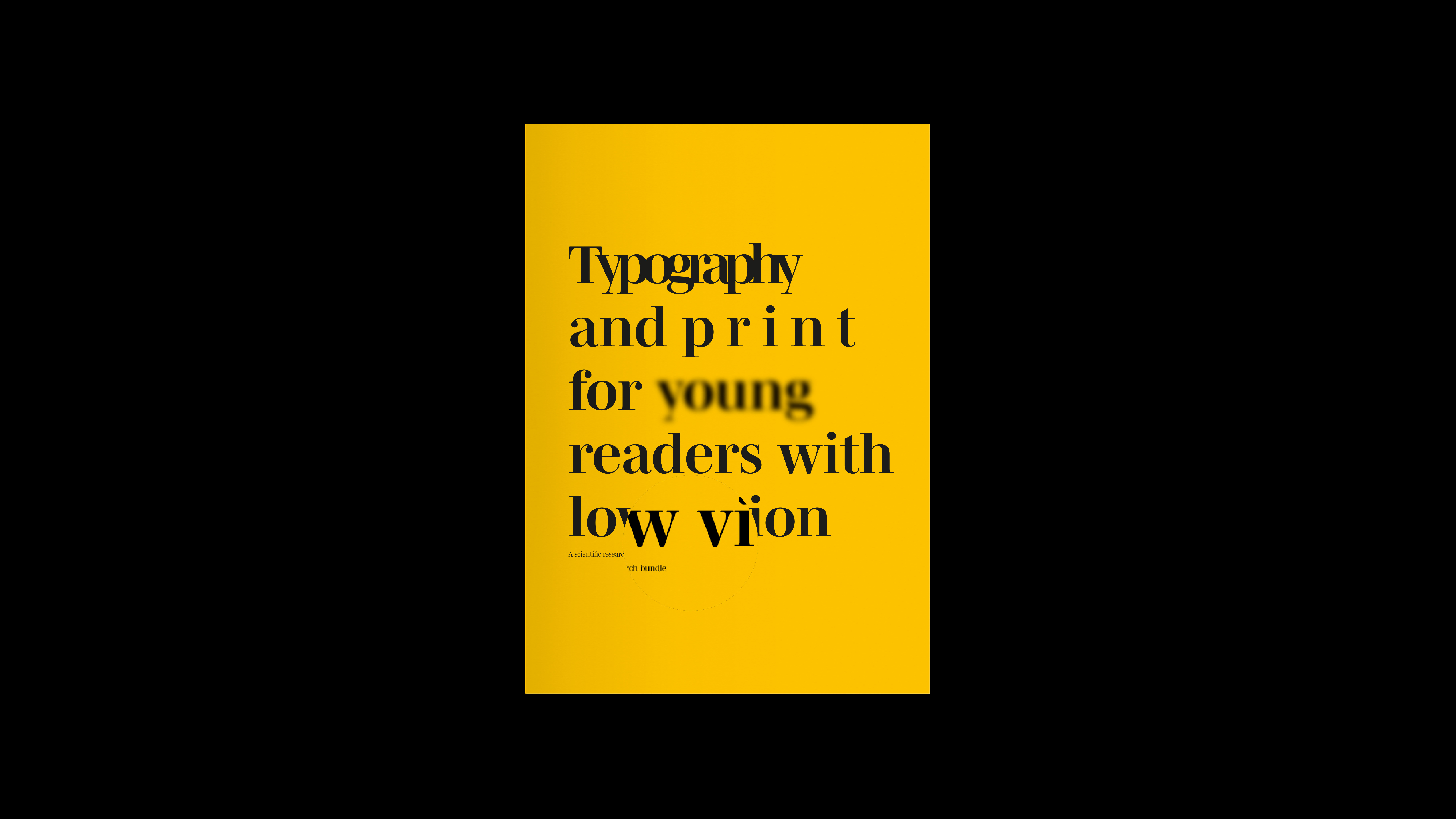
"Typography
and print for young people with low vision" is a hybrid publication
designed to raise awareness about readability for visually impaired children.
This project, aimed at creating an urgent publication about a topic close to my
heart, marked the first in a series of projects dedicated to my personal
experiences as a visually impaired designer.
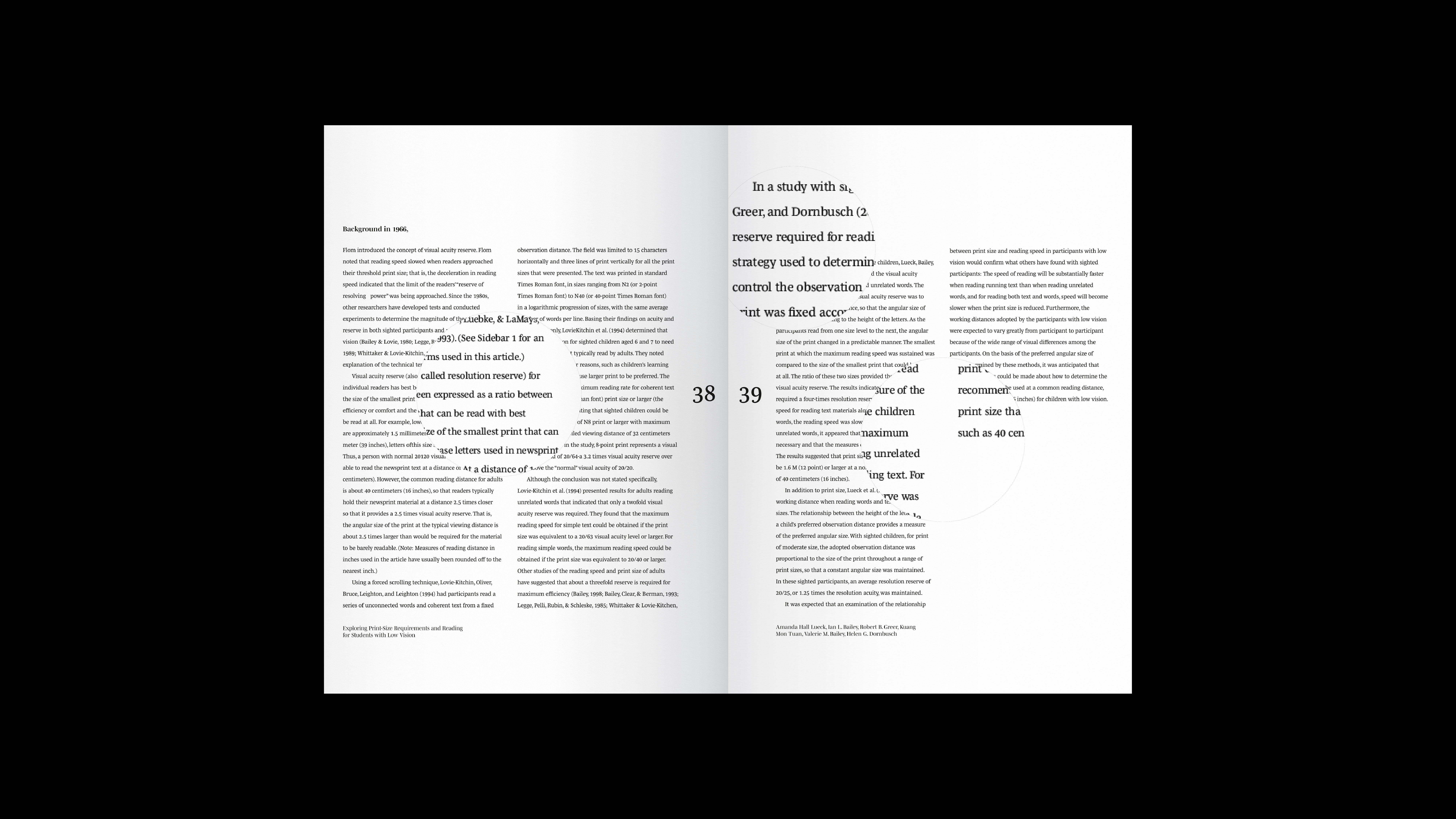
By collecting academic research and experimenting with recollections from my own childhood as a visually impaired person, I crafted a publication that serves as informative material for designers, policymakers, educators, and others. Its purpose is to enhance readability for this specific audience and thereby raise awareness of the issue, but more importantly, to provoke.
By collecting academic research and experimenting with recollections from my own childhood as a visually impaired person, I crafted a publication that serves as informative material for designers, policymakers, educators, and others. Its purpose is to enhance readability for this specific audience and thereby raise awareness of the issue, but more importantly, to provoke.
The design
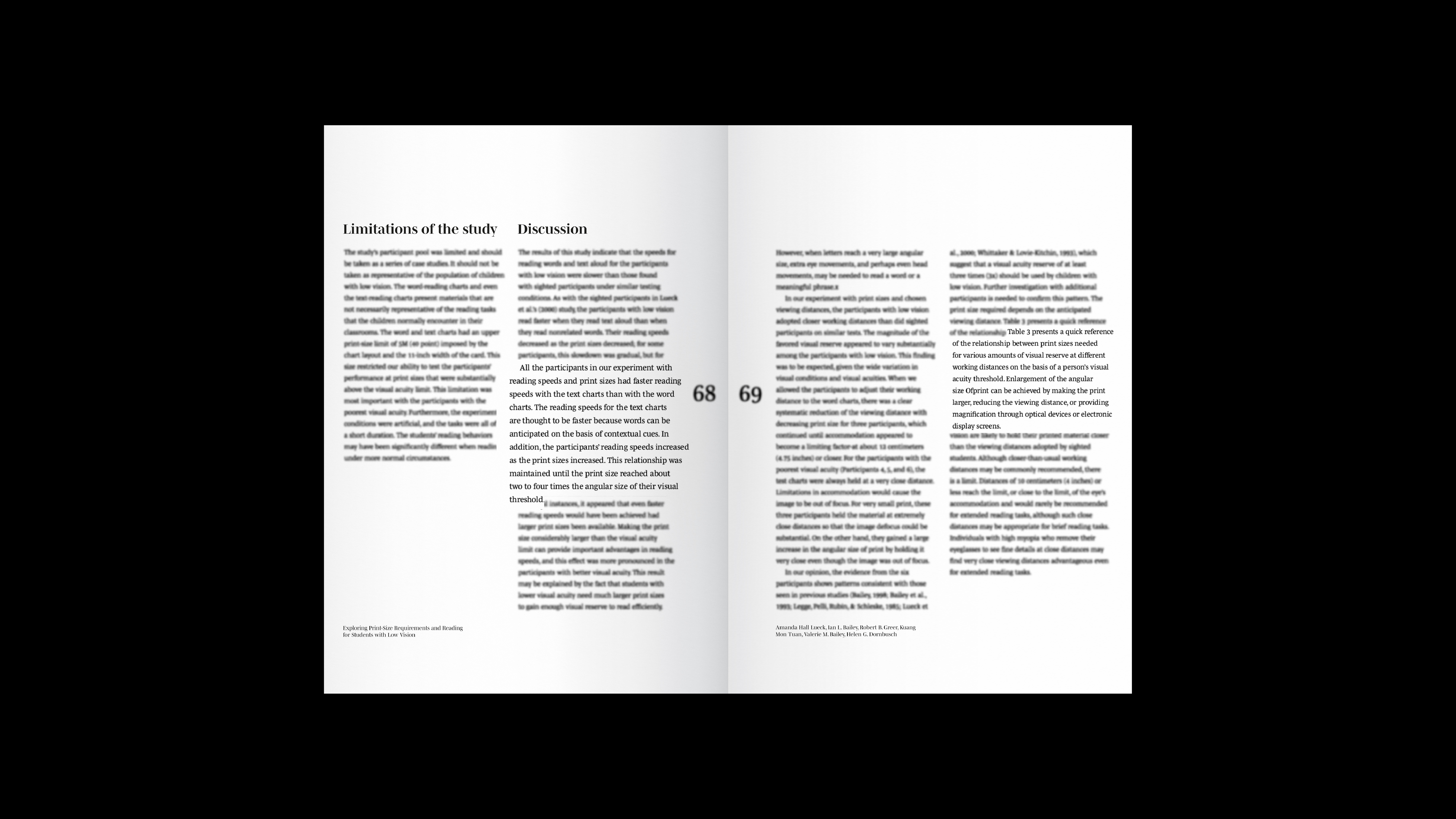
incorporates a hybrid component, meaning that alongside a physical book, the
publication also includes a website, without which the content of the book
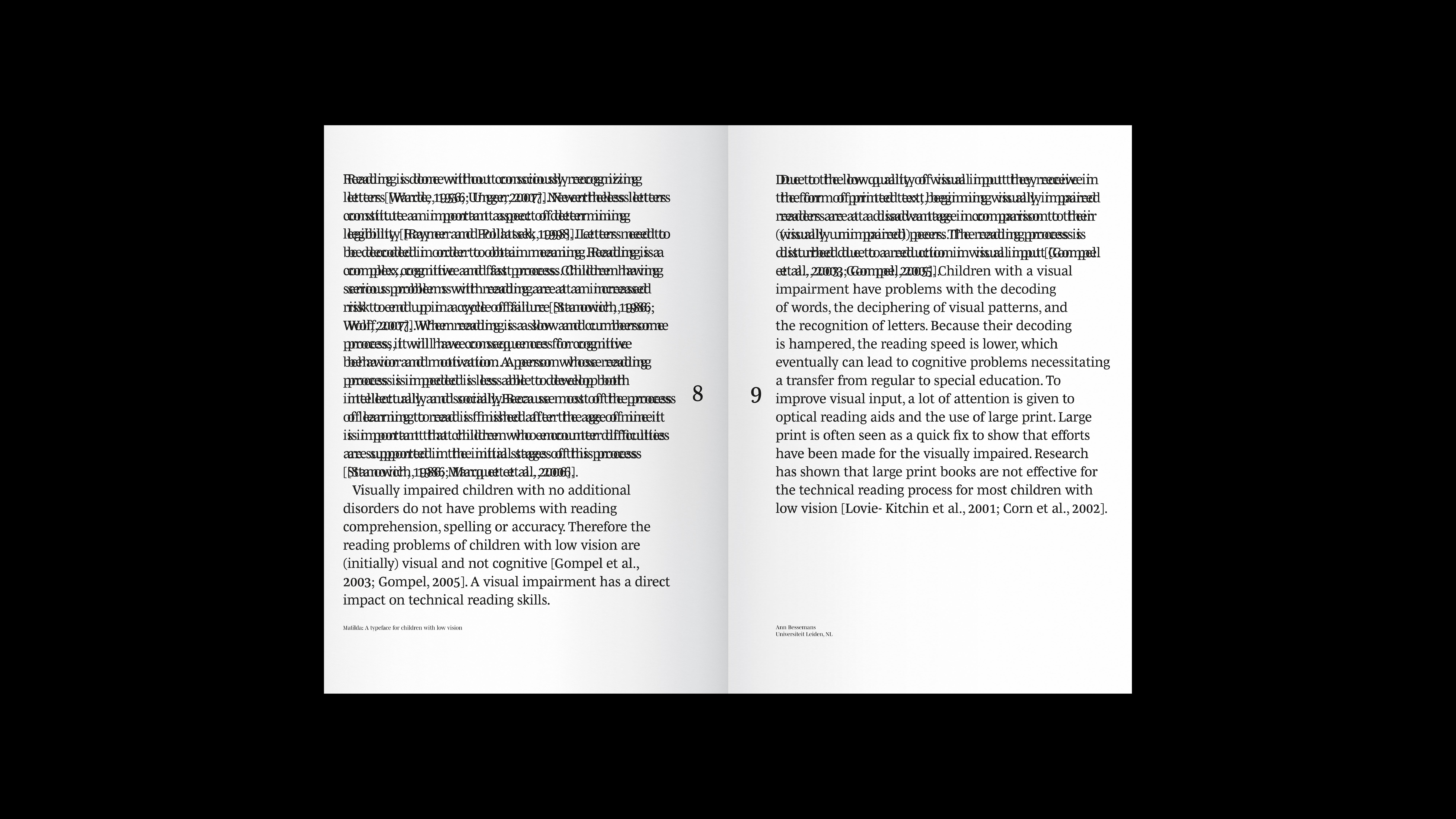
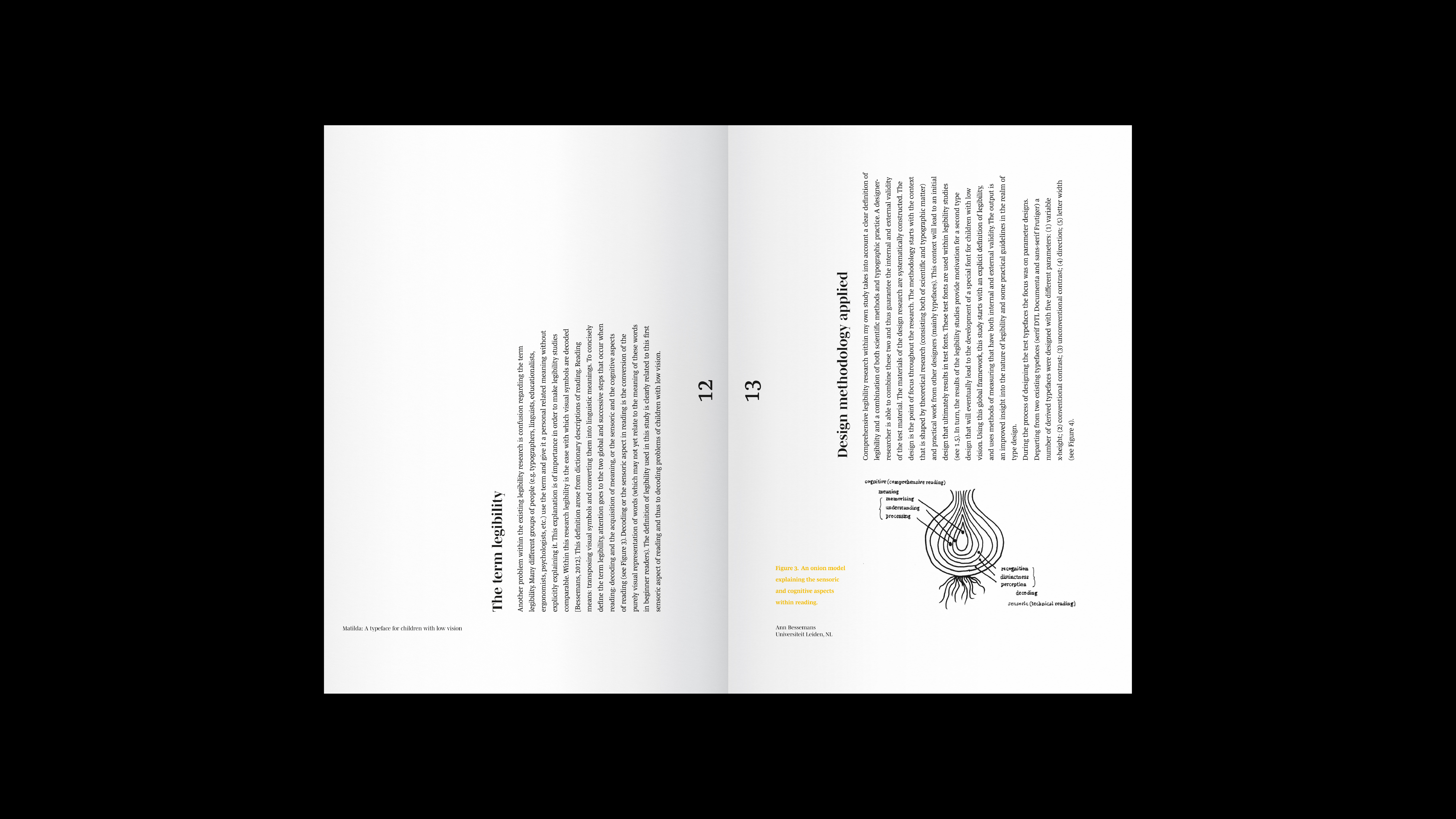
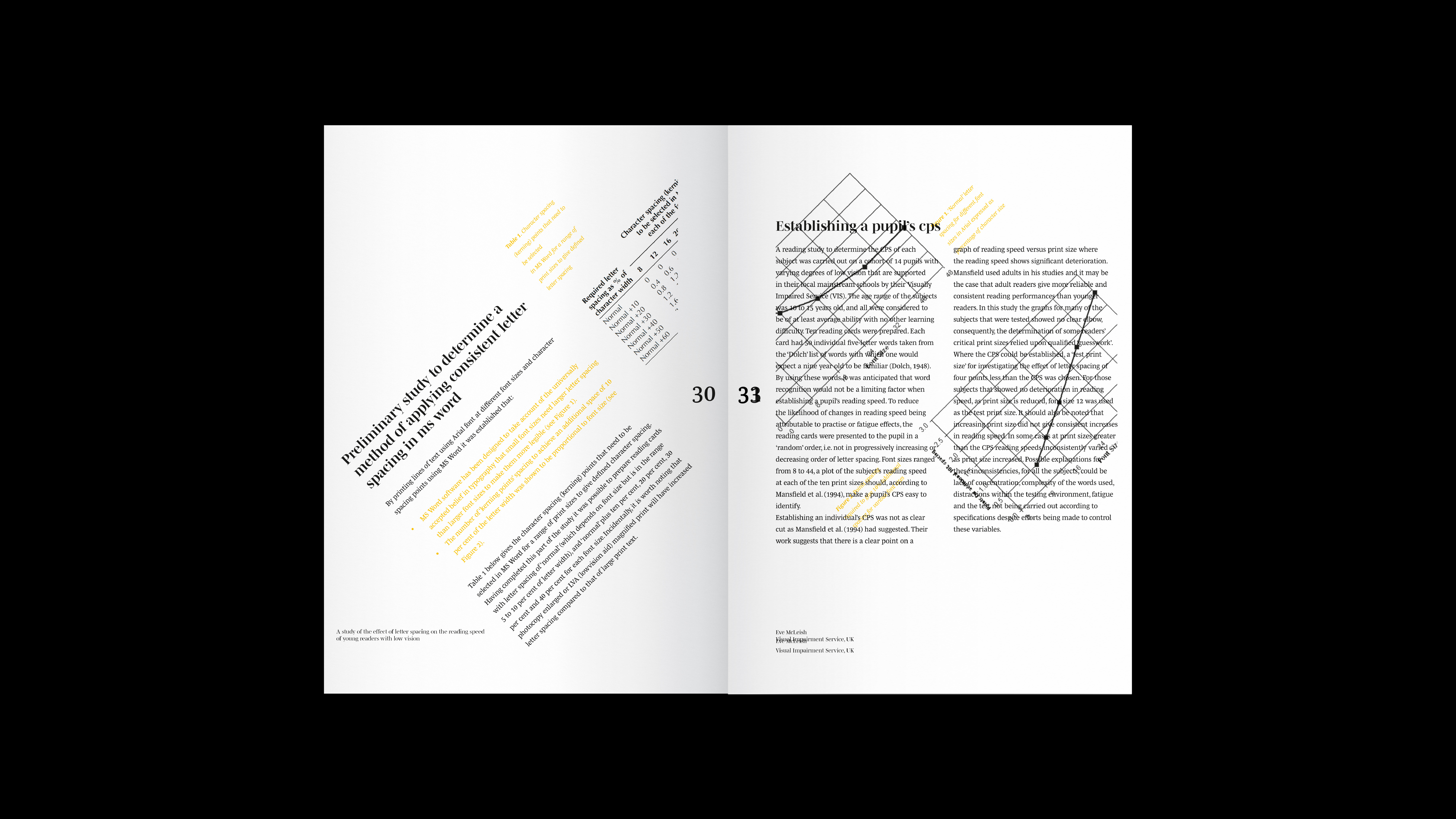
alone becomes challenging to utilize. By structuring the book in a way that
disrupts the flow of content for visually impaired children struggling with
poor legibility, the use of tools becomes essential to fully absorb all
information as a reader.
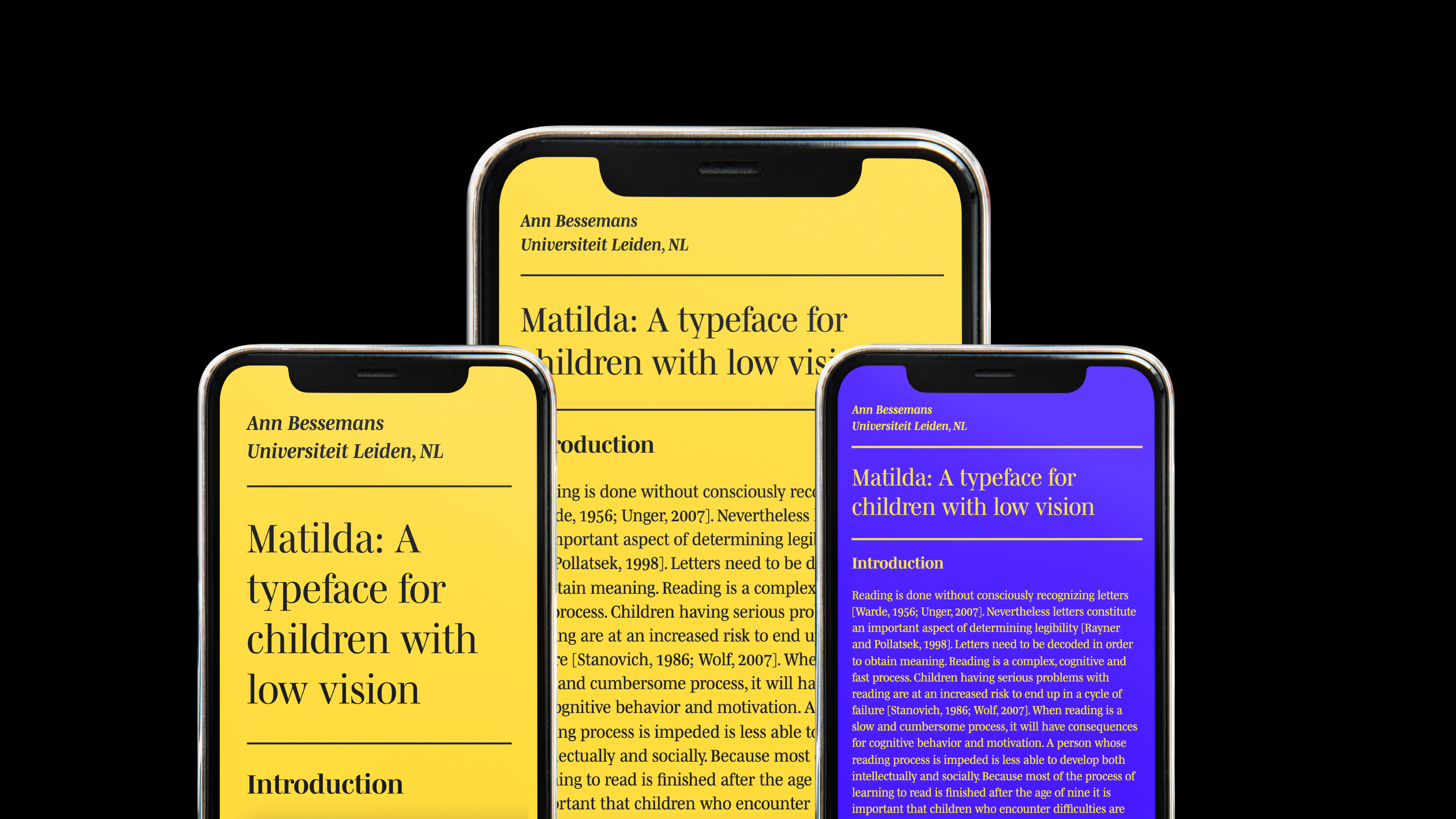
The digital aspect of the publication serves as a solution, drawing inspiration from outdated tools to create a portal that, through scanning a page from the book with a smartphone camera, offers a fully responsive version of the specific chapter. This version can be personalized to one's preference in terms of size, typography, and color scheme to ensure optimal readability.
The digital aspect of the publication serves as a solution, drawing inspiration from outdated tools to create a portal that, through scanning a page from the book with a smartphone camera, offers a fully responsive version of the specific chapter. This version can be personalized to one's preference in terms of size, typography, and color scheme to ensure optimal readability.
Special thanks to
Bartiméus
Bartiméus