
Brand identity and packaging design
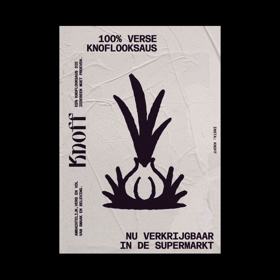
Knoff is a fresh, handmade garlic sauce meant to be shared and enjoyed widely. The sauce is sharp, refined and rooted in culinary craftsmanship. I was asked to design a visual identity and packaging that would stand apart from the often sterile and generic look of supermarket condiments. From custom type to a garlic-shaped mascot and illustrations based on the full life cycle of garlic, from seed to growth and clove to bulb, every element was created to express the essence of garlic in a playful and characterful way.
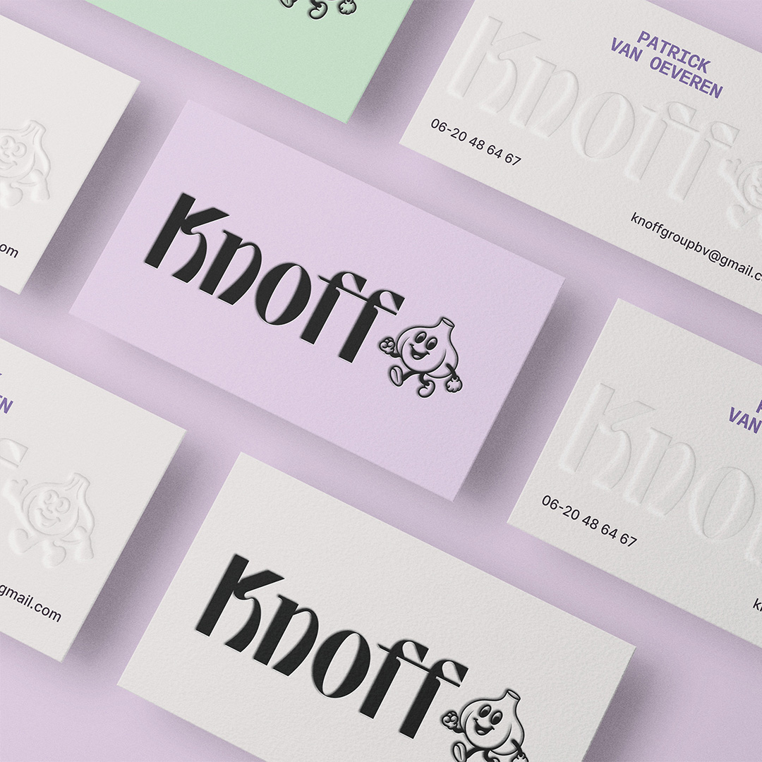
The logo is inspired by what lies at the heart of Knoff: garlic. The typographic wordmark takes its shape from the organic curves of a garlic bulb and gives a modern, playful twist to classic Italian letterforms. Its custom serifs and sharp ink traps are visual nods to the stem and the bold character of garlic itself.
The logo is inspired by what lies at the heart of Knoff: garlic. The typographic wordmark takes its shape from the organic curves of a garlic bulb and gives a modern, playful twist to classic Italian letterforms. Its custom serifs and sharp ink traps are visual nods to the stem and the bold character of garlic itself.
Complementary to the wordmark is a vintage illustrated mascot that can be used for variation and added recognisability. The mascot shares its style with the broader illustration system, which forms the foundation of Knoff’s visual language. Each illustration is inspired by the full life cycle of garlic, from sprouting seed to clove and bulb, placing emphasis on freshness and origin. The use of subtle irregularities and a hand-drawn aesthetic adds a crafted, authentic quality that sets Knoff apart from the conventional world of stock imagery. Supporting the expressive logo is a more modern and functional typographic system that ensures clarity across applications. The colour palette, like the rest of the identity, is rooted in garlic but reinterpreted with a distinctive twist. Purple serves as the visual anchor, establishing category recognition, while a deep variant adds contrast and elegance. The palette is complemented by a soft off-white referencing the inside of the garlic bulb, and a fresh green drawn from the stem. Together, these elements create a visual identity that is both grounded in origin and unmistakably unique.